4 Easy Steps To Create a Stunning Movie Poster
Every good movie has a great movie poster that preceded its release. Most designers use Photoshop and other designing tools to create posters. If you haven’t made one before, you’re better off starting with a movie poster template. With that, you can make a movie poster in 5 quick steps.
Before we go into the steps, let us look at the basic elements of a good movie poster.
Basic elements of a movie poster

· Poster design style
The style of a movie’s poster tells a lot about the movie at first glance. At least that’s what you want it to do. It is a great marketing strategy that big studios use till today. It is making movie posters that blend into the actual movie and adopt its identity.
You want your design style to reflect the movie genre, so you need to use the right visual signifiers. Viewers don’t often look for movies. Rather, they search for movies in their preferred genre. You want your movie poster to fit into your movie’s genre and convey the right message.
· Photo effects
You don’t need any over the top photo effects on your movie poster. It shouldn’t look gimmicky. The poster only needs some design features that signify its genre and the direction the movie takes. Needless to say, you don’t want your movie poster looking like a cliché of every other movie in the same genre.
You can keep your poster looking fresh by using subtle photo editing to change the photo’s tone. Maybe use some shadow to give a thriller poster a gloomy look. Use moody palettes and silhouettes to create the desired effect.
· Relevant font
The font you choose will make or break your movie poster. Okay, that is dramatic. But fonts are important for a movie poster. You don’t need to go overboard with your font design to make a statement. Simple, easy-to-read fonts over contrasting backgrounds are what you need. You can also give the nod to the genre by using novelty fonts.
· Accurate poster size
The size of the poster matters if you intend to print or distribute the poster. Otherwise, you can get away with most sizes. You can also recreate the poster in different sizes to cover all bases.
Steps to creating a movie poster with a template
1. Pick a good movie poster template
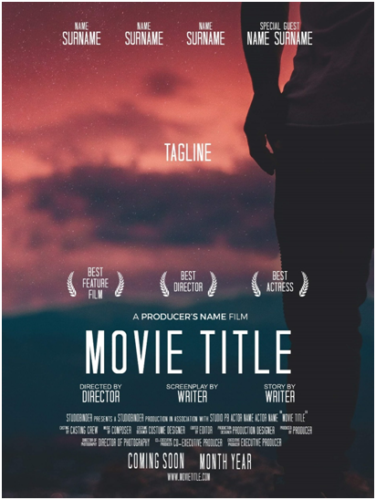
The first step is picking a great movie poster template from the many samples available online. Many of them come with already made layouts and color palettes. You can always adjust the look to your taste, but it is best to pick one that resonates with your movie. Once you have your template, you can move on to the next step.
2. Select and edit a good picture
The best pictures to use for a movie poster are those you took yourself. Use high-resolution pictures and not screenshots or low-quality pictures. Try to get a still from the movie if possible. Your best bet is taking photos of certain scenes of the movie specifically for making the poster. Or you can get a photo that works well with the movie’s themes.
Your photo needs some photo manipulation before it’s ready to use. Now, there are many tutorials where you can learn how to add effects to photographs. The general rule is to stay within the theme of your movie. Your poster’s effects need to match the message.
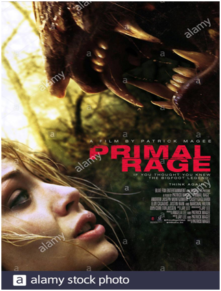
Thriller/Action movies usually feature bold colors, preferably red and black — textured and chaotic fonts. The design should be intense and pull in the viewer.

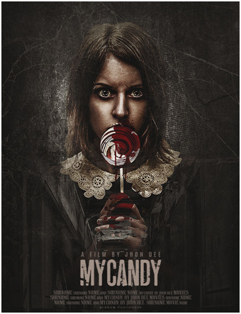
Horror movies are. You can go with gory images, shadows, mysterious images, or a minimalist approach with dated fonts and subtle symbolic images.

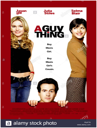
Comedies tend to have lighthearted, pastel colors: positive color palettes and clean, playful fonts. The focal images are usually characters expressing the mood of the movie.

Dramas are perhaps the most diverse movies. Stick with recreating the emotions of the movie. Stills work for dramas and can accurately portray the right message.

3. Add a title to the poster
You can place the title of your movie anywhere. If your photographs take center stage on the poster, your title can be at the top or bottom. Don’t bother with effects on the movie’s title, especially if you already have them elsewhere. Keep things simple — unless you want the movie title to be the focus of the poster.
4. Add a tagline
It would help if you had a memorable tagline to add to your poster. Come up with a short line that hints at the movie but doesn’t give it all away. Taglines add something to your poster and make it look more professional. Sometimes, the tagline is what grabs the viewer’s attention. So, please pay attention to it.
5. Add the top credits to the poster
Adding credits to your movie poster is the most important step. You cannot skip this step by any means. Use the same font as the title, albeit in a smaller size. Put the director’s name or the highest-billed actor’s name at the top of the poster, and the other credits, including the studio names, can go at the bottom of the poster. You can look at some good movie posters for some guidance.
Creating a movie poster is super easy. With five steps, you’re well on your way to creating beautiful posters.